
20220630
1. 前言
自从上次发贴ArkUI eTS上实现"流光按钮"效果 后,觉得效果有了,但不能以后每个项目用到此类型按钮,都要复制代码来修改,这时组件的优点就显示出来了,此贴来说说,如何把上篇流光按钮做成一个组件。
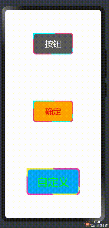
2. 效果
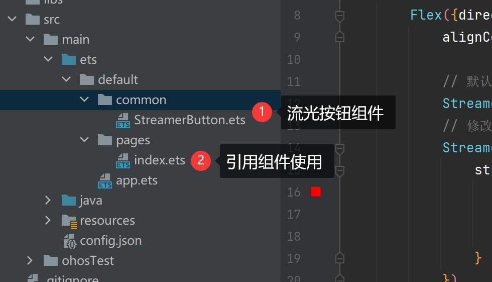
3. 项目结构
4. 组件介绍
组件包含了UI布局,组件属性定义,组件默认值,组件代码有详细说明,可以直接看代码
@Component
export struct StreamerButton {
@State private angle:number = 0;
private speed:number = 5;
private interval:number = 0;
@State private isActive:boolean = false;
public streamerButtonAttribute: StreamerButtonAttribute = null;
aboutToAppear() {
this.streamerButtonAttribute = StreamerButtonAttribute.filter(this.streamerButtonAttribute)
this.speedChange()
}
aboutToDisappear() {
clearInterval(this.interval)
}
build() {
Stack({ alignContent: Alignment.Center}) {
Rect().width(this.streamerButtonAttribute.width * 2)
.height(this.streamerButtonAttribute.height - this.streamerButtonAttribute.border * 2)
.fill(this.streamerButtonAttribute.streamerColor)
.rotate({ x: 0, y: 0, z: 1, angle: this.angle })
Stack({ alignContent: Alignment.Center}) {
Text(this.streamerButtonAttribute.text)
.fontSize(this.streamerButtonAttribute.fontSize)
.fontColor(this.streamerButtonAttribute.fontColor)
}
.width(this.streamerButtonAttribute.width - this.streamerButtonAttribute.border)
.height(this.streamerButtonAttribute.height - this.streamerButtonAttribute.border)
.backgroundColor(this.isActive ? this.streamerButtonAttribute.backgroundColor : this.streamerButtonAttribute.foregroundColor)
.onTouch(() => {
this.isActive = !this.isActive
})
.onClick(() => {
this.streamerButtonAttribute.clickCallback?.call(this)
})
.borderRadius(10)
}.width(this.streamerButtonAttribute.width)
.height(this.streamerButtonAttribute.height)
.backgroundColor(this.streamerButtonAttribute.backgroundColor)
.clip(new Rect({width: this.streamerButtonAttribute.width, height: this.streamerButtonAttribute.height}))
.borderRadius(10)
}
speedChange() {
var that = this
that.angle = 0
this.interval = setInterval(function(){
that.angle += that.speed
}, 15)
}
}
class StreamerButtonAttribute {
public text:string = '按钮';
public fontSize:number = 30;
public fontColor:Color | number | string | Resource = '#FFFFFF';
public width:number = 150;
public height:number = 80;
public border:number = 6;
public foregroundColor:Color | number | string | Resource = '#5a5a5a';
public backgroundColor:Color | number | string | Resource = '#ef437f';
public streamerColor:Color | number | string | Resource = '#00FFFF';
public clickCallback: () => void;
public static filter(streamerButtonAttribute: StreamerButtonAttribute): StreamerButtonAttribute {
if (null == streamerButtonAttribute || undefined == streamerButtonAttribute) {
streamerButtonAttribute = new StreamerButtonAttribute();
} else {
var defaultAttribute: StreamerButtonAttribute = new StreamerButtonAttribute();
if (undefined == streamerButtonAttribute.text) {
streamerButtonAttribute.text = defaultAttribute.text;
}
if (undefined == streamerButtonAttribute.fontSize) {
streamerButtonAttribute.fontSize = defaultAttribute.fontSize;
}
if (undefined == streamerButtonAttribute.fontColor) {
streamerButtonAttribute.fontColor = defaultAttribute.fontColor;
}
if (undefined == streamerButtonAttribute.border) {
streamerButtonAttribute.border = defaultAttribute.border;
}
if (undefined == streamerButtonAttribute.width) {
streamerButtonAttribute.width = defaultAttribute.width;
}
if (undefined == streamerButtonAttribute.height) {
streamerButtonAttribute.height = defaultAttribute.height;
}
if (undefined == streamerButtonAttribute.foregroundColor) {
streamerButtonAttribute.foregroundColor = defaultAttribute.foregroundColor;
}
if (undefined == streamerButtonAttribute.backgroundColor) {
streamerButtonAttribute.backgroundColor = defaultAttribute.backgroundColor;
}
if (undefined == streamerButtonAttribute.streamerColor) {
streamerButtonAttribute.streamerColor = defaultAttribute.streamerColor;
}
}
return streamerButtonAttribute;
}
}
5. 使用组件
如何使用自定义组件,首先引用自定义组件文件,如下:
import {StreamerButton} from '../common/StreamerButton.ets'
使用如下:
StreamerButton()
具体使用自定义组件,提供参数,请看代码详情
import {StreamerButton} from '../common/StreamerButton.ets'
@Entry
@Component
struct Sample {
build() {
Flex({direction: FlexDirection.Column, justifyContent: FlexAlign.SpaceAround,
alignContent: FlexAlign.Center, alignItems: ItemAlign.Center}) {
StreamerButton()
StreamerButton({
streamerButtonAttribute: {
fontColor: '#FF0000',
text: '确定',
foregroundColor: Color.Orange
}
})
StreamerButton({
streamerButtonAttribute: {
text: '自定义',
fontSize: 40,
fontColor: '#00ff00',
border: 10,
width: 200,
height: 100,
foregroundColor: '#03a9f4',
backgroundColor: '#f441a5',
streamerColor: '#ffeb3b',
clickCallback: () => {
AlertDialog.show({
message: '您点击自定义按钮',
autoCancel: true
})
}
}
})
}
.width('100%')
.height('100%')
}
}
6. 总结
使用组件后,主界面简洁明了,不用在关注组件里的具体实现,简单引用就可以得到一个漂亮的流光按钮.
| 
 3
3


 7133
7133


 淘帖
淘帖
 赞
赞
 回复
回复 显身卡
显身卡